.png)
Fragmented User Experience-
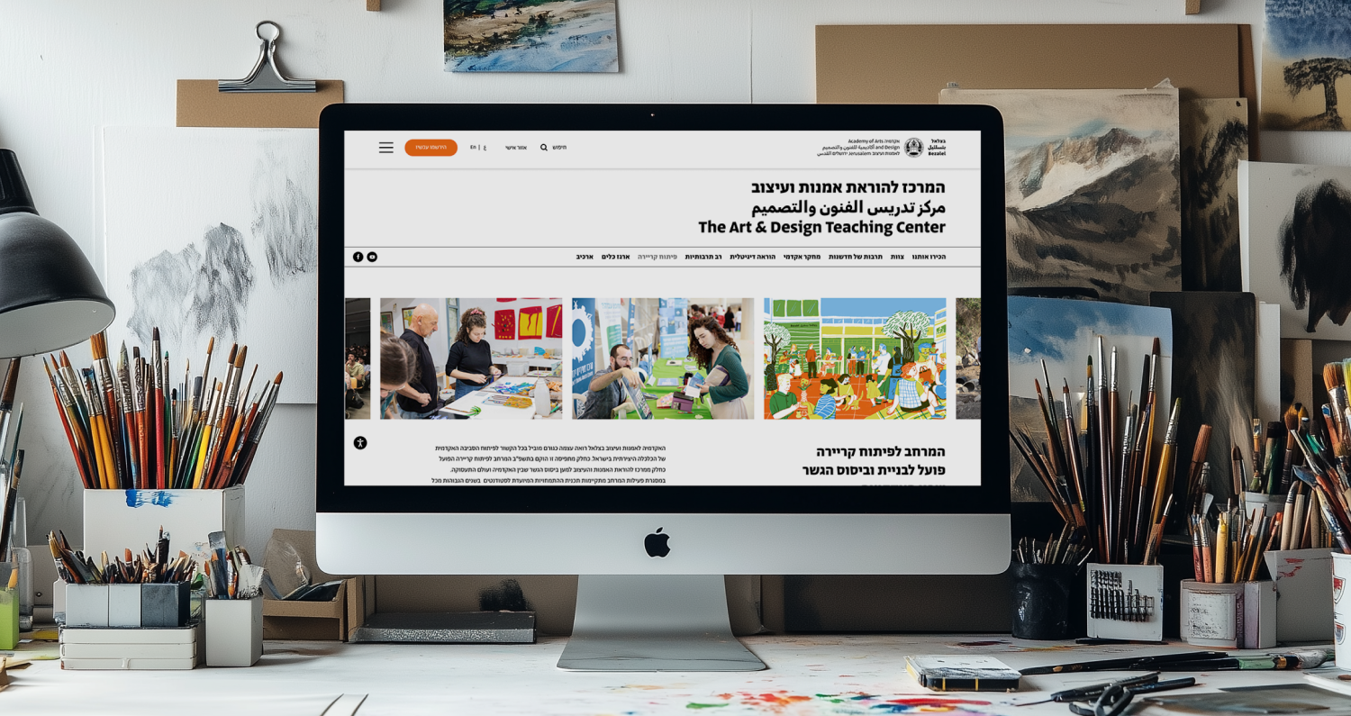
The Bezalel Art and Design Teaching Center had a wide range of educational materials - documents, videos, and methods - but lacked a clear structure for presenting them online. Without a defined page hierarchy or navigation, users struggled to find relevant content or understand the Center’s teaching approach.
Although the visual design was pre-defined, the absence of content organization limited usability and impact.

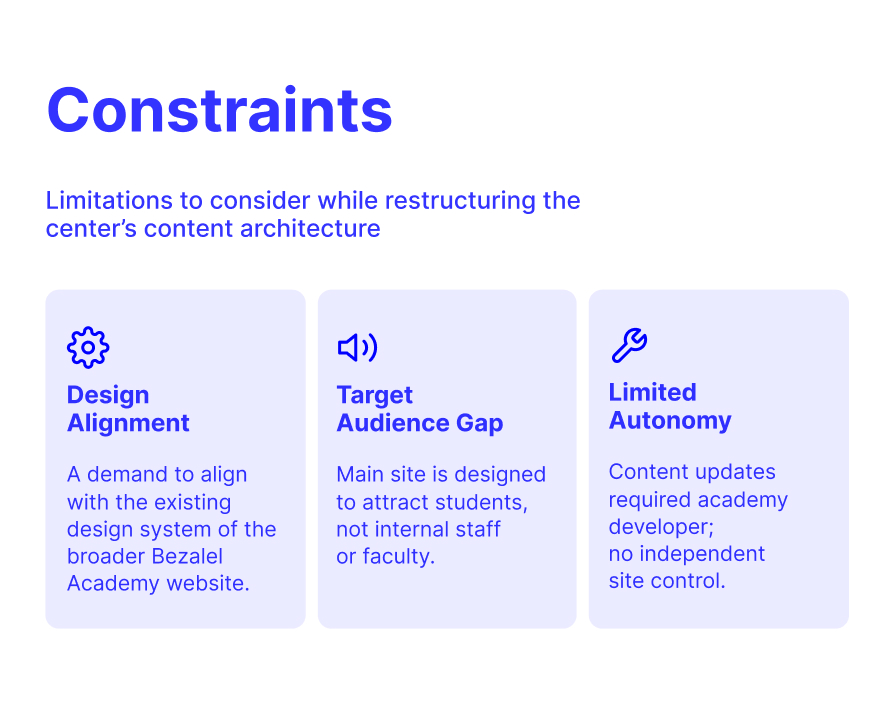
To initiate the process, I worked on defining the project’s core mission by asking: How can we design a website that effectively supports the Center's goals while working within its limitations?
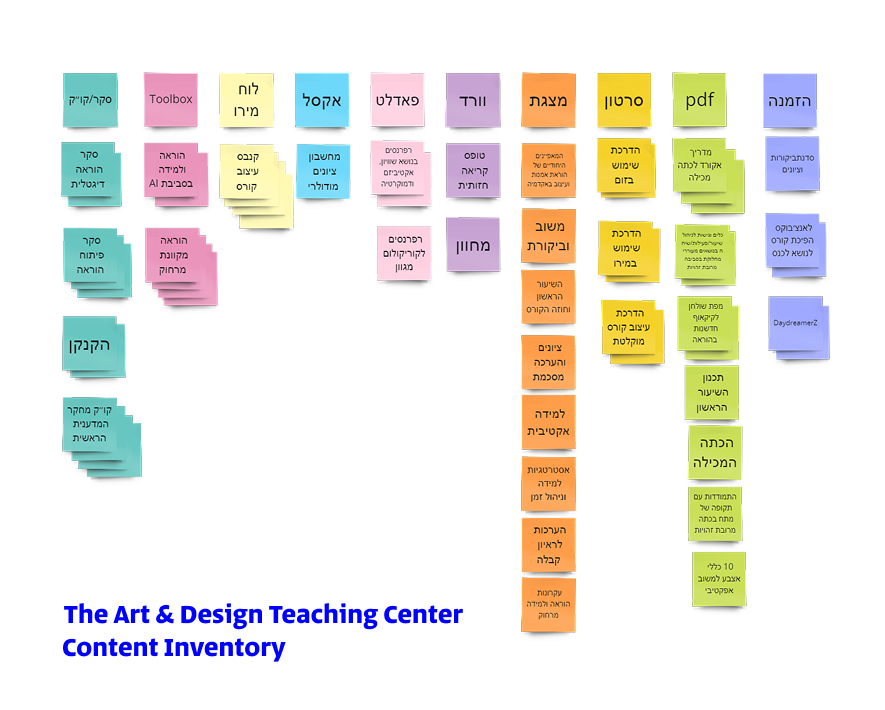
The first step was conducting an audit of the existing website structure. I mapped each page and color-coded the types of media it contained - documents, videos, links, and other teaching materials. This visual mapping revealed unintuitive user flows and redundancies, as many materials could belong to multiple pages without clear categorization.
Through this analysis, I identified over 10 distinct content types, highlighting the various methods the site would need to allow. This process also served as an initial content inventory, helping us understand what we had before deciding how to organize it.
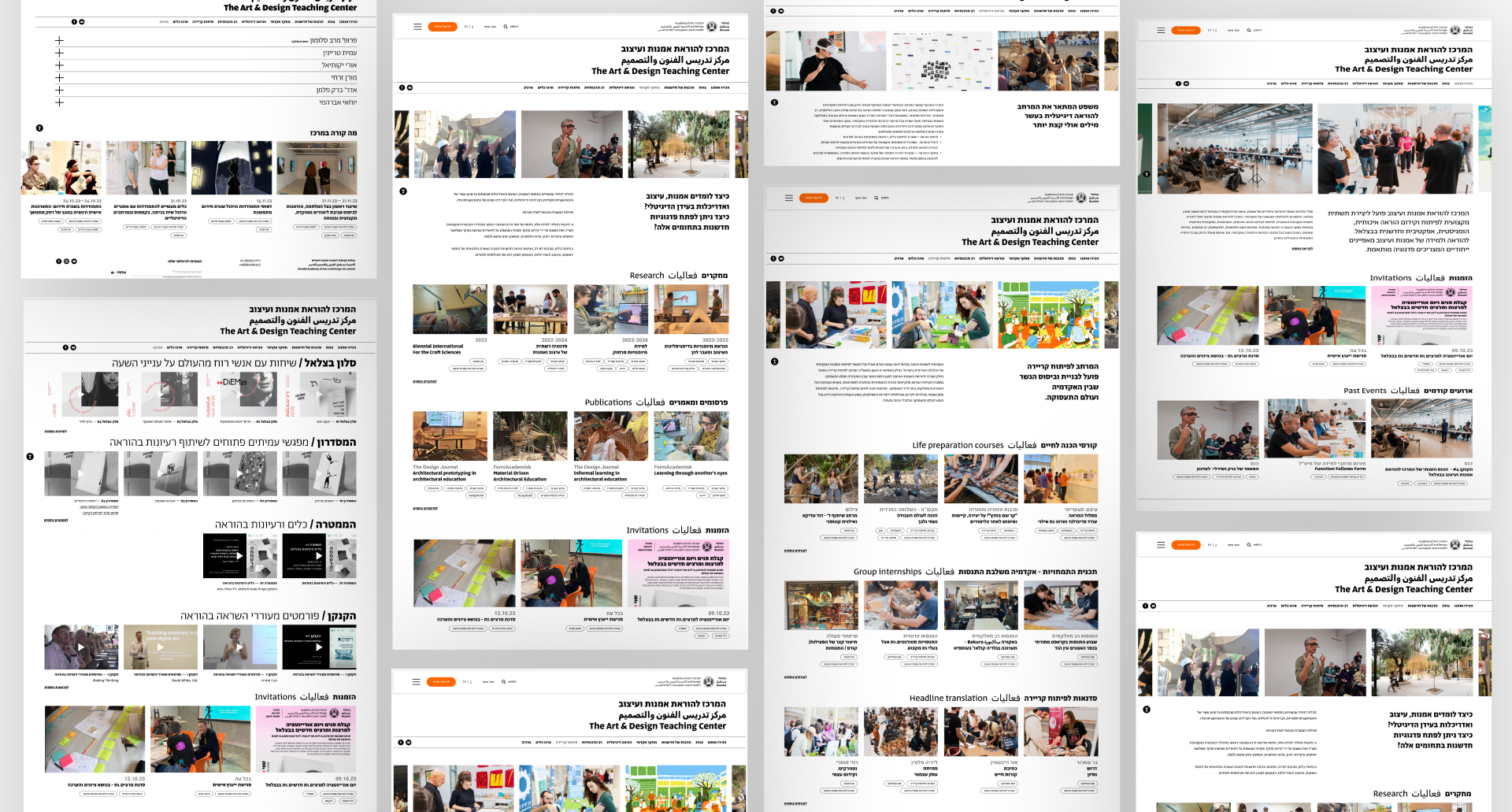
While the initial idea was to create format-based pages (e.g., tutorials, links, files), it quickly became clear that a section-based approach would better support both clarity and user intent. We redefined the site architecture so that each page functions as a dedicated “digital space” for a specific focus area of the Teaching Center.
As a result, nine core pages were defined:
Home, Team, Culture of Innovation, Research, Digital Tools, Multiculturalism, Career Development, Toolbox, and Archive.


For each section of the site, I designed a page template that aligned the space’s purpose with its relevant content and the appropriate UI components available within the existing design system.
Each page opens with a hero carousel and an introductory section that clearly communicates the space’s values and goals. Below that, I implemented content card grids—modular, reusable components featuring a thumbnail image, title, short description, and contextual tags—to present related materials in a structured, scannable format.
To drive engagement, each page concludes with contextual calls to action, such as invitations or open calls tied to the Center’s activities in that space, encouraging faculty participation and deeper involvement.
.png)
.svg)