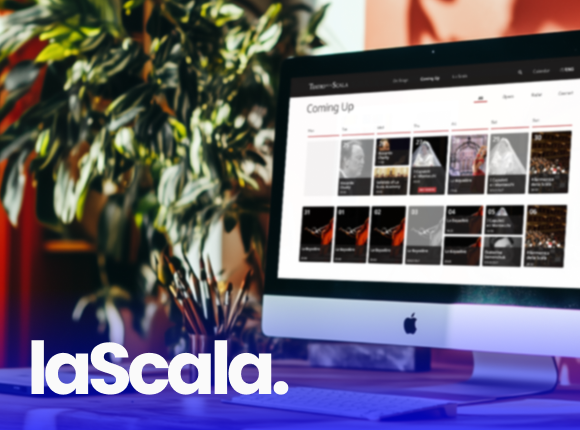
.png)

Teatro alla Scala's website sufferes from an overwhelming and inconsistent user experience. The interface lacks hierarchy, coherence, and clear navigation, making it difficult for users to access basic information, understand the calendar, or complete ticket purchases. The purchase flow, in particular, is fragmented, unintuitive, and requires external registration, leading users to abandon online purchases or seek help from others. For older or less tech-savvy users, the experience is especially alienating, ignoring accessibility and reducing digital engagement.


The redesign process followed a user-centered approach:
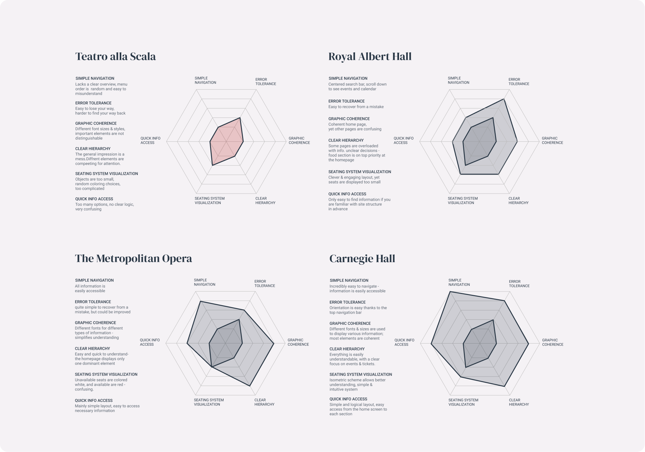
>> Context & Benchmarking:
I analyzed the website's goals—mainly ticket sales and program information—and benchmarked it against major cultural institutions such as the Metropolitan Opera, Royal Albert Hall, and Carnegie Hall, identifying key usability gaps.
>> User Research & Personas
I developed four detailed personas, and identified core frustrations through empathy mapping: complex ticket flows, calendar confusion, and poor seat-selection usability.
>>Task Analysis
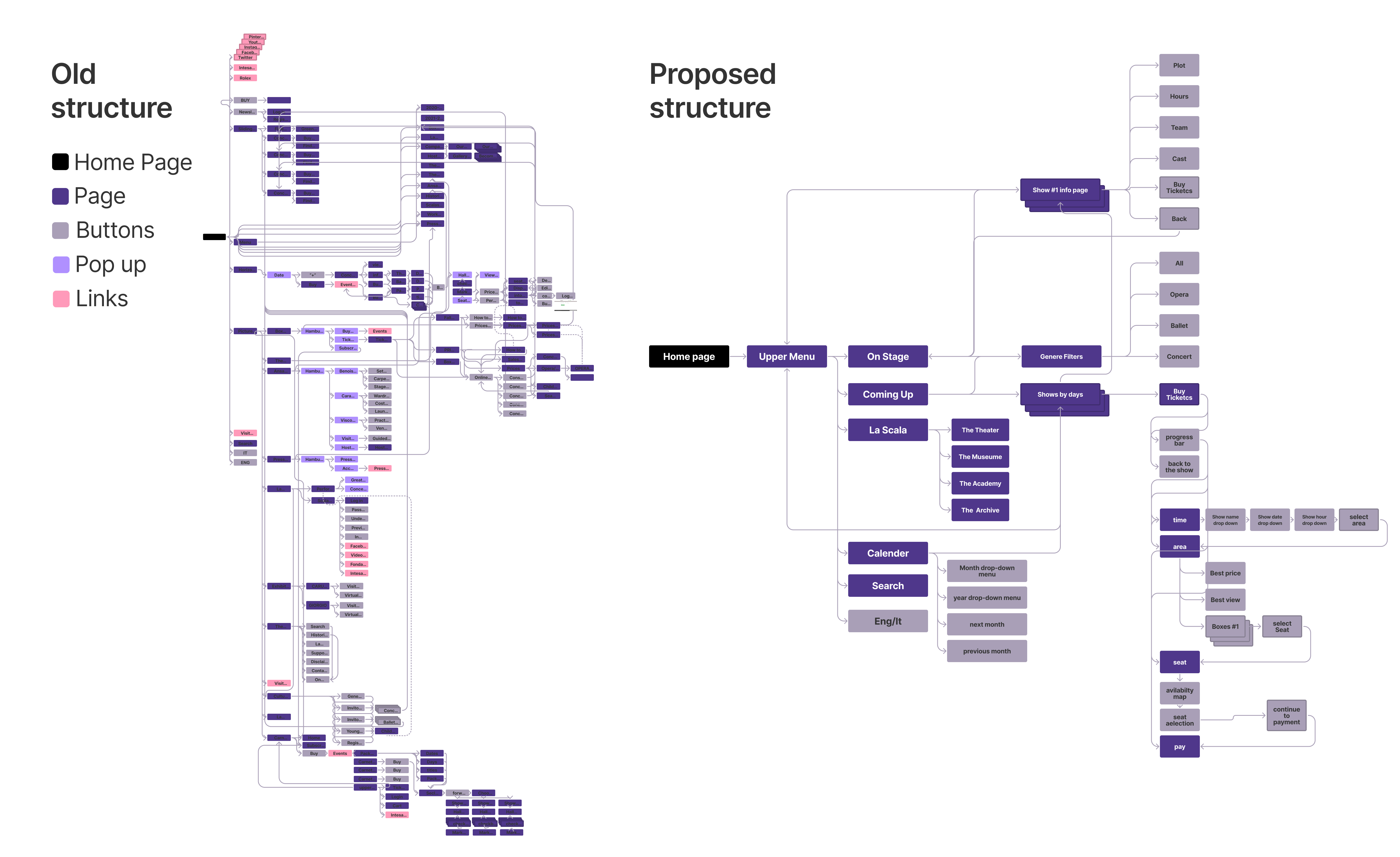
I mapped the full user journey for three key actions:
Finding performance information; Buying a ticket; Choosing a seat;
Each flow was broken down by number of clicks, page depth, and friction points—highlighting significant inefficiencies and design inconsistencies.
>> UX Prioritization & Goal Definition
The redesign goals were to make show information easily accessible; to create a simplified ticket purchasing process; to improve the seat selection experience; to ensure accessibility and usability across a range of user needs
>> Wireframing & Prototyping
Using Figma, we created interactive prototypes to present the new layout logic, button visibility, filter systems, and user flows.
A redesigned website experience grounded in clarity, accessibility, and task efficiency:
1. Information Architecture
>> A clean homepage hierarchy with a clear header, calendar, and search bar.
>> Grayscale cues to indicate past events, and dropdown filters for genre, date, and year.
>> Unified the event and calendar views for seamless exploration.
2. In-Site Purchase Flow
>> Made the "Buy Tickets" button prominently visible on the homepage.
>> Removed the need to register on an external vendor site.
>> Integrated a step-by-step progress bar and dropdowns to allow system feedback mid-process.
>> Eliminated redundant paths.
3. Enhanced Seat Selection Experience
>> Designed a larger, more intuitive seating map with consistent color coding.
>> Enabled users to preview the stage view from selected seats before purchasing.
>> Highlighted best-view options within the user’s budget or preferences.
>> Improved contrast and visibility of selected and available seats.
.svg)