.png)
EZbra is an innovative medical device startup founded by a breast cancer survivor, with the mission to transform the post-surgical experience for breast cancer patients.
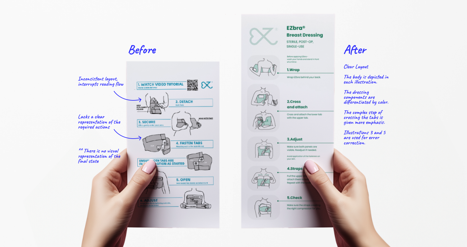
The post-marketing surveillance report found that patients perceive the product instructions for use as unclear, leading to improper use of the dressing, frustration, and a reduced likelihood of continued use. The former instructions-for-use had no clear and coherent layout, adding to the confusion.

.png)
I recruited testers with no prior EZbra experience, and while prioritizing their privacy, I met each tester at home in a quiet setting. Tests were taken fully clothed, with optional face masks, and filmed from behind as they faced a mirror to capture expressions and body language. I clarified it was a product evaluation, not a personal test, and encouraged them to adjust or restart as needed.
I developed a set of metrics to guide me through this process.
Since identifying failure points in the application process was crucial, I divided each tester’s experience into three stages, aligned with the structure of the Instructions for Use (IFU): Placing, Cross & Attach, and Straps.
For each step, I measured:
Task completion time [Efficiency];
Success rate [Clarity];
Instruction reference frequency [Memorability] ;
Emotional responses [including frustration, satisfaction, and confusion];
This approach allowed for a clearer understanding of where users encountered difficulties and how the IFU could be improved.
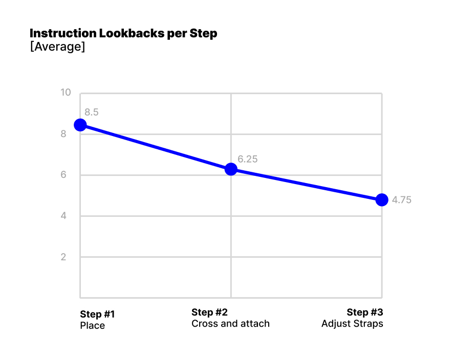
>> Step 2, "Cross and Attach", was failing our testers. Three out of four did not complete this step successfully, leading to incorrect EZbra wear.
>> As we progressed through the steps, our testers looked back at the instructions fewer times - starting from an average of 8 times for the first step, to 4 times for the last. we needed to make the first step shorter, clearer, and more memorable.
>> We need to present what it looks like when all steps are completed correctly, allowing error recovery. Step 3, "Adjusting the straps", is clear and easy for our testers to complete, even if they made a mistake at step 2, leaving no clue that the EZbra is not properly on.


I focused on improving clarity and guidance through a more structured layout and visual hierarchy.
Illustrations were placed consistently on the left, with accompanying text on the right.
To improve spatial orientation, the body was included in every illustration, ensuring users could easily understand the dressing’s placement in context.
Step 2—"Cross and Attach"—was identified as a critical action and was emphasized with two sequential illustrations and a larger frame for better visibility.
To support user success and reduce errors, I added verification steps (3 and 5) to confirm that Step 2 was performed correctly and that the dressing was properly secured by the end of the process.
Additionally, a new patient instructions video was directed, based on the rewritten steps in these redesigned instructions.
.svg)